summary

Listen to the Article Experience the future of video production with Adobe’s latest AI tools that are set to transform the industry. Discover how artificial intelligence is reshaping the way videos are created and edited, making the process more efficient and innovative than ever before. The Evolution of Video Production Join Jason Druss, Senior Product […]


Are you in search of ways to start with the creative tools like Photoshop, Illustrator, InDesign, etc.? Or perhaps you want to learn how to use these applications yourself? Introduction Transition and thesis: It was the norm that you would have to pay for expensive textbooks or pay for expensive classes to learn how to […]
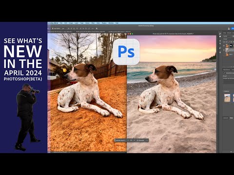
videos
Are you in search of ways to start with the creative tools like Photoshop, Illustrator, InDesign, etc.? Or perhaps you want to learn how to use these applications yourself? Introduction Transition and thesis: It was the norm that you would have to pay for expensive textbooks or pay for expensive classes to learn how to […]